
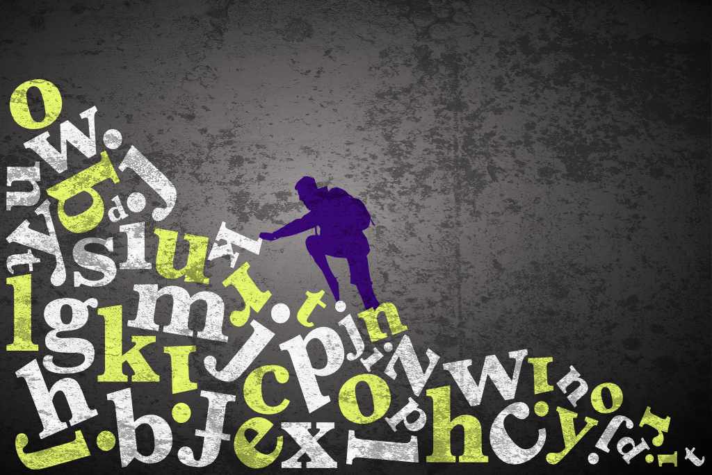
To many business owners, typography is merely the blurb that goes on a poster or some written information that supports other dominating graphical elements in a design. This common assumption does typography a profound disservice. Typography is a world bursting with beauty and complexity, a world where words and their divisible letters are not just functions of information sharing. They are every bit as graphical as the pictures they accompany. In this article, we’ll explore why typography matters so much to your business, from its role in readability to its ability to shape your brand identity through emotion-inducing triggers.
What Is Typography?
Typography is the art and technique of arranging type (or letters) into formations that both maximise readability and satisfy the eye. It is a subtle balance of function and beauty. Unlike other design elements that tend heavily towards the visual, typography resides in, and is constrained by, the written word. It must stick to recognisable symbols of language. Typography’s primary function is to deliver information through words and sentences that are clear and digestible, without disturbing the harmony of its surroundings. Visual design elements have no such constraints — they are only limited by the imagination of your designer.
So, why is typography important in graphic design? Because good designers make no distinction between typographic and graphic elements. While colourful visuals like posters and social media graphics tend to hog the limelight, typography brings the details. It could simply describe the “offer” in a dry and matter-of-fact manner, or it can reveal what the visuals mean if they are cryptic. It can even make ordinary visuals funny if the words are contrasted in such a way that makes you look at the visuals again. Imagine a picture of a bruised cyclist on the floor having just crashed his bike into a tree. Underneath, in small, unassuming type are the words, “Should have gone to Specsavers.” The words have changed the image. A tragedy has become a comedy. One could give all the credit to the copywriter, but the font, the spacing and its placement — the very things that make your marketing memorable — are down, in some considerable part, to the typographer.
The Key Components of Typography
The key components of typography include typefaces, fonts, spacing and alignment. You don’t need to master these yourself, but knowing what they do helps you see exactly what you’re paying for when you invest in good design.
Typeface is a design that encompasses different sizes, styles and weights, whereas font is specific formatting through which we experience the typeface. In practice, you will often notice people use these terms interchangeably, but they’re actually distinct concepts. The style of font carries its own meaning and associations. A font family is a style that carries its visual attributes through the entire alphabet. The same applies to numbers, grammatical symbols and strokes. Most font families will have light, heavy and italicised variations.
Font sizing and spacing customise the look and feel and readability of text. Obviously, the bigger the font, the better the readability. Where sizing and spacing become trickier is in the body copy (the main body of text), where text must necessarily be smaller but still maintain readability. “Leading” (the space between the lines above and below) and “kerning” (the space between each letter in a word) both function as tools to maximise readability no matter the scale. Typography is extremely important in graphic design because effective typography design balances these elements to create a harmonious and legible composition — one that keeps your audience reading instead of switching off.
“Alignment” refers to whether a body of text aligns (or adheres) to the left, centre or right of a page. Justified alignment forces lines of text to stretch from left to right, stopping square at the margins on either side, eliminating the jagged edges produced by differing sentence lengths. How a designer chooses to align text depends on the nature of the material and how much space is available. Because your branded material must be consumed quickly and easily, text alignment must take readability as the primary deal-maker/breaker. Typography is important in graphic design because it’s treated in graphic terms. Certain alignments may look awkward and imbalanced when paired with the visuals, and developing an intuition for layout balance is a process that comes with experience — exactly the kind of experience you’re buying when you bring in a designer.
Understanding Font Types and Classifications
There are two most commonly used types of fonts: serifs (letters with lines and strokes) and sans-serifs (letters without lines and strokes). Both evoke a different sensation in your audience. Other types include slab serif, script, monospace and display, but these are used less frequently.
Take Times New Roman as the quintessential serif font. Each letter features delicate lines and handles like regal furniture. It is found in classic English novels or imposing legal documents — a feeling of timeless antiquity, reliability, taste and all things proper.
Helvetica, a sans-serif font, is stripped of barbs and handles. Just simple lines and curves, clean of ornamentation. It feels fresh and modern, evoking the sleekness of modern interior design, a brand-new laptop or a shiny new sports car.
While there are thousands of font styles, they will all fall within one of these categories. Understanding the underlying psychology of different font styles is crucial in marketing and branding, and the experienced designer will have an instinct for typefaces, knowing intuitively which fonts carry the appropriate connotations and emotional weight for your business.
How Typography Affects Readability
Remember that at its root, typography is a means of transmitting information. The decorative or ornamental aspects of a font must always play a supporting role to the function of the words. If your audience can’t read the “offer” in an advertisement, then what is the purpose of typography at all?
In a city setting, you have seconds to capture the attention of passing prospects with a billboard campaign. It’s no different online. Your prospect is scrolling through thousands of pieces of data per day at a rattling pace, so short slogans in big, beautiful letters are a great lure for frenzied eyes. The experienced graphic designer understands what your customers’ eyes enjoy seeing. Large, clear, inviting words are great for a header, with smaller, lighter text coming in for support. Eyes don’t like small, thin, densely-packed words in blocks and columns — this quite often repels people. Reading an ad shouldn’t feel like hard work.
With font styles, graphic designers often tend towards sans-serif fonts. They are clean and simple, absent the little barbs and strokes that tend to clutter a design. Sans-serifs are simply faster for the eye to process, and they read well across different digital devices with their varying screen shapes and sizes. In web design, for example, for large-screen devices, a font size of at least 16 pixels is typically recommended for body text to enhance readability.
That’s not to say there isn’t a place for serif fonts in advertising. The legal profession and financial services curry much business from the classical font style. It appeals to people who are perhaps more careful and studious, who relate more to the classy, timeless style the serif projects.
Hierarchy of type elements means there is an explicit order of importance. Not all words and slogans are equal. Your customer’s eye must be drawn to the most important information first, guided from one rational point to the next, so information builds linearly, answers questions and rewards curiosity.
Headings will be larger and placed in a premium spot on the layout — normally where the name of your product goes. Sometimes an ad opens with a slogan and the name of the product comes after that, but the name would still be bigger than the slogan preceding it. Subheadings expand the details — the description of the problem, followed by the solution and how it can be found (the call to action) — and should be kept to a minimum to avoid an overload of elements. What is it about typography that makes it so important in graphic design? Really, it’s all about balance. Too much clutter leads to confusion, frustration and downright ugliness. Great designers know when to hold back or lay it on thick — and that judgement call is worth paying for.
How Line Spacing and Letter Spacing Influence Text Clarity
It can never be emphasised enough that readability is the benchmark of good typography. Concepts such as leading, kerning and alignment all serve to adjust the relationship between lines of text, the space between words and the space between letters within the words themselves — fine adjustments that aim to achieve maximum readability no matter the scale or device.
Poor letter spacing will have letters scrunched too close together or stretched too far apart, meaning the word is either uncomfortable to read or misread entirely. If line spacing is too tight, the wrong line can be read or re-read by accident, along with a sense of claustrophobia when reviewing the text as a whole. Typography is important in graphic design because it’s as graphical as all other elements. Taking a step back and viewing text from a distance helps your designer make fine-tune adjustments so that lines, letters and words hit that sweet spot where typography feels comfortable, looks attractive and, most importantly, optimises readability for your customer.
The Importance of Contrast for Readability in Typography
High contrast between the text colour and background colour makes content much more easily readable, allowing viewers to easily differentiate between elements. Dark text set against a white background remains the default across print and digital media. For your business, contrast is a tool that can be manipulated to emphasise certain areas of text — headings, subheadings and body copy can be clearly separated with variations of contrast and tone. Likewise, links and calls to action can also be emphasised with shifts of contrast.
How Typography Conveys Emotion and Brand Identity
Beyond its function as a means of communication, typography can be shaped and styled in many ways. For brand identity, there is a typeface for every brand. For example, for a toy company, there are thousands of chunky sans-serif fonts that resemble balloon shapes or comic-strip headings. For legal firms, there are tall and regal serif typefaces with beautiful flourishes that evoke strength, reliability and balance.
The Emotions Different Fonts Evoke
Typography is immensely important in graphic design because type is as expressive as any graphic element. Different typographic styles embody personalities of their own. Some fonts are fun and bouncy while others are bold, broad and strong. A boxing club franchise is unlikely to choose a fun and bouncy font when something more redolent of boldness and strength is ideal — the emotional charge of a font must marry with the theme of your brand.
A 20-year-old guy looking to join a gym will qualify or disqualify a business based on how coherent the brand messaging is. He will unconsciously pick up on jarring inconsistencies like poor font selection on a gym flyer. If the font selection is too light and thin, what chance is there of him growing any muscles at that particular gym?
Consistency in Typography Is Crucial for Brand Recognition
Building familiarity and trust between your brand and your audience takes time. It’s no different to two strangers meeting, sizing each other up and deciding whether it’s worth investing more towards a longer-term affiliation.
Once your business establishes itself in the marketplace, its personality, appearance, ethos and intent must be immovable. Once an audience identifies with your brand and is willing to invest time, attention and loyalty based on what it projects, it’s on those terms that a relationship can grow. Consistency is very important.
When choosing a typeface, it should share your brand’s DNA in some way, matching the sentiment your brand projects on all its advertising without “breaking character”. Why is typography so crucial to consider in graphic design? Because, again, type is as expressive as any graphic element. A font style that clashes or contradicts your brand’s signature style or ethos will cause disharmony and cultivate a sense of betrayal in those who invested in your business.
In line with this, graphic designers must stick firmly to a typographic formula consistent with a brand’s previous output. In practice, this would mean that unless a radical rebrand is in order, Coca-Cola cannot simply shift from its classic cursive style typography to Times New Roman without upsetting loyalists and putting a massive dent in sales.
Frequently Asked Questions
Why is the importance of typography so emphasised in graphic design?
The trick is to not see typography as separate from other design elements. It is an extension of design through words, numbers and grammatical symbols that not only transfers information but also reinforces and balances a design. The countless styles, sizes and weights available to your designer mean there is a whole world of possibilities to complement any idea imaginable for your business.
How does the choice of typeface impact a design project?
Every typeface embodies a mood or character, a feeling or association. Imagine if letters wore clothing to suit a particular occasion: Times New Roman works beautifully for a formal, classy banquet or business meeting, while a light and simple Helvetica suits a more casual affair. When paired well with other design elements, a magical reaction takes place, eliciting feelings and emotions in the viewer. Good graphic designers understand the implicit meaning of design elements and the kinds of emotions they provoke — exactly what you want working in your favour.
Can you explain the importance of typography in web design?
Consider your average laptop, desktop, tablet or smartphone, and the variety of screen shapes and sizes, all backlit and using the RGB colour spectrum. Here, typography must remain clean and clear at every scale. Sans-serif fonts work best at smaller scales because they forfeit decorative handles and hooks for simple, elegant readability. Backlit displays also let typography appear more colourful and vivid, giving your web designer a wide range of opportunities to enhance navigation or highlight important information like calls to action on your website.
What are some key aspects of typography that businesses should consider?
First, the importance of hierarchy. Information deemed most important must grab attention first. Headings and subheadings must be sized in a way that emphasises which information dominates and which acts as support, leading the eye from one area of a design to the next in a rational, comprehensible manner.
Also, adjustments of font size, weight, line spacing, letter spacing and contrast are small changes that make a huge difference to how words read and feel — fine-tuning instruments that come into play after your typeface has been selected.
Why should businesses care about typography when working with a designer?
Typography is an art, a science, a philosophy and a formula that can elicit feelings and emotions from your audience. It’s steeped in rich history — some typefaces date back centuries, with origin stories featuring the early scribes of religion and philosophical thought — and it shares commonalities with mathematics, geometry and architecture. It’s a beautiful area of study, and exactly why it’s worth getting right. Typography is so important in graphic design because it essentially IS graphic design. That’s why.
What are some reasons why typography is important in logo design?
Remember that typefaces and fonts elicit certain feelings and emotions in the viewer. Your logo needs to visually convey a certain attitude or feeling to match your ethos or mission statement. For example, a modern, premium tech company may want a smooth and stylish sans-serif typeface to reflect its progressive, envelope-pushing values.
How does typography contribute to the overall message of a design?
The right typeface and arrangement can enhance the tone and mood of your content, guiding the viewer’s perception and emotional response. It creates visual order and clarity, helping organise information into a hierarchical structure that’s easier for your audience to digest. It’s all about creating harmony between form and function. Typography is incredibly important in graphic design because design is a form of storytelling, the marriage of pictures and words.