The capacity to perceive and interpret colour plays a huge part in the survival and evolution of our species. To primitive man, colour signalled the relative dangers of certain fruits, fungi and fauna. Throughout history, colour also indicated man’s state of physical well-being and his position in the social hierarchy. Drawing from the vast storehouse of human experience, humans have developed a glossary of colours and ascribed to them associative meanings. Every colour, hue and shade carry a corresponding signal, either positive or negative, in order to determine the safety or utility of the object in sight. The very survival of our species has depended on our ability to harness colour as a tool to discriminate between what is safe and harmful. In the modern age where the dynamic of predator vs. prey is dampened by contemporary mores, colour is used more frivolously to help human beings determine what is pleasurable and what is not. So how does this relate to colour psychology in marketing and branding?
Marketers have long understood that branding colour is the most important element of any marketing strategy. Above concept and layout, nothing speaks to the consumer as directly and as deeply as colour does. Colour stimulates feelings, unearths memories, flatters the ego and promises positive outcomes. Colour also modifies behaviour, alters perception and creates an opportunity for persuasion to work its magic. Human beings are naturally pleasure-seeking creatures. As such, they are more receptive to colours that evoke comfort, pleasure and status than colours that elicit anxiety, weakness and danger. A strong marketing strategist utilises colour to encourage positive feelings in the consumer. It is no underestimation to state that brands live or die based on the colours they choose.
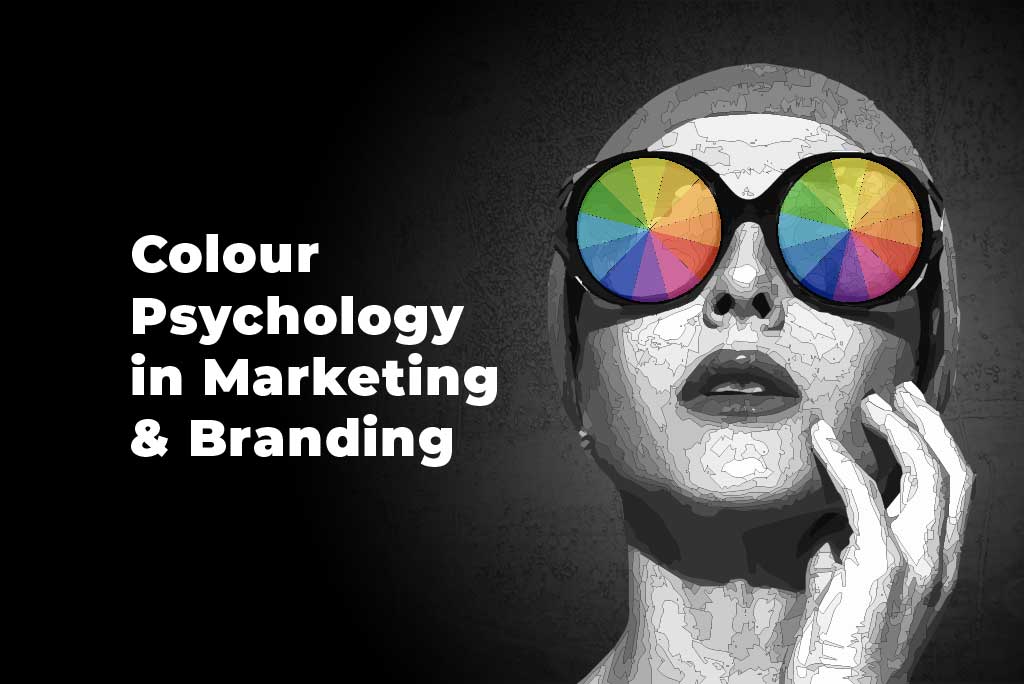
What Is Colour Psychology?
Colour psychology is the study of how colours can be used to influence human behaviour, emotions and perceptions. It explores the psychological and emotional responses people have to different colours and how these responses can impact their thoughts, actions and decision-making processes. Central to brand marketing is persuasion. Knowing colour theory — and weaving it skilfully into a brand’s identity — is the single most effective way to establish a firm and enticing identity in a fiercely competitive marketplace.
While colour psychology is not an exact science and individual experiences and cultural backgrounds can modify colour perceptions, there are general rule-of-thumb associations and patterns that hold true across many cultures and societies.
Why Is Successful Branding and Marketing Based on Colour Psychology?
Colour has the ability to evoke emotional responses in people. By understanding the psychological associations and effects of colours, brands can strategically choose colours that align with their brand personality and connect with their target audience on an emotional level. When consumers feel an emotional connection with a brand, they are more likely to develop brand loyalty and engage with its products or services. Consider McDonald’s yellow arches and their contrasting red background — it’s an indelible image branded in the minds of generations of people worldwide. Its signature colours have become inseparable from the logo design. Logo and colour have essentially become one and the same.
Colours play the most crucial role in communicating a brand’s message, personality and values. Colour also determines where the brand is positioned and who is more likely to be receptive to its charms. Different colours convey different meanings, and the blending of two or more colours can evoke distinct associations in specific demographics. By strategically selecting colours that align with the brand’s personality, marketers can increase accessibility and shape how consumers perceive and interpret their brand.
How Do Colours Affect the Brain?
Many studies, such as anthropologist Lynne Isbell’s research on the evolution of colour vision, describe how colour vision was used by primates to spot snakes and fruits that may or may not be harmful when encountered.
The savvy marketer chooses brand colours that speak directly or indirectly to the mammalian survival instinct in our brains. Upon seeing the yellow colour, the cave-dwelling savage of yore and the city trader on Wall Street will connect it to the luminosity of the sun and all its warm and fuzzy associations.
So what are the common meanings and associations of each colour?
Red Colour Psychology
Primary associations: power, excitement, passion, energy, fearlessness and strength
Red is a dynamic and visceral colour that conveys love and horror with equal intensity. Desire and fear are both urgent, involuntary sensations. Red is the beating heart of the colour spectrum. It demands that you hurry and take action. It is not an accident that call-to-action buttons are often red.
Blue Colour Psychology
Primary associations: stability, trust, reliability, calmness and relaxation
Blue is associated with calm, trust and dependability. Unlike the pumping physicality of red, blue is still and inward looking. Evoking the clear sky and ebbing sea, blue speaks directly to our primitive impulses. Its uniform approachability makes blue the most popular colour worldwide in statistical terms. Blue is also a highly versatile colour, utilised by therapists and cybersecurity companies and everything in between. Its association with trust and reliability makes it a popular choice for hospitals, dentists and spas.
Green Colour Psychology
Primary associations: nature, growth, renewal, strength and relaxation
The earthiness of green evokes the lushness of spring. Green is free of all impurities and, like blue, inspires dependability and trust. It projects good health, vitality and a sacred allegiance to the earth’s ecological well-being. In fact, green stands in the middle of the colour palette — a synonym for balance — creating a perfect, soothing fit. Health and beauty brands, as well as borough councils, use green to convey a sense of responsibility for the natural world, whether sincere or not.
Yellow Colour Psychology
Primary associations: happiness, optimism, confidence, inspiration and humour
The appeal of yellow speaks to early humanity’s relationship with the sun. Yellow embodies the essence of renewal, youthfulness, cheerfulness and unwavering optimism. Almost anything associated with happiness tends to be adorned in yellow. For example, children’s products are largely synonymous with the colour yellow. By dint of it being the easiest colour to see, infants have an initial tendency towards yellow before any other colour.
Purple Colour Psychology
Primary associations: spirituality, royalty, elegance, imagination and mystery
Purple projects regality and grandeur. Adorned by kings and queens, purple denotes quality, discernment, exclusivity and scarcity. The heady mix of red and blue strikes a perfect equilibrium between the physical and the spiritual realms. Luxury, loyalty, courage, mystery and magic are frequently conveyed through the use of purple. Magicians, expensive hotels, gourmet chocolate brands and Prince all owe a significant debt to purple.
Pink Colour Psychology
Primary associations: imagination, passion, creativity, empathy and sensitivity
Pink is commonly associated with the feminine. It also embodies qualities of playfulness, compassion, love, harmony and, at times, immaturity. In the West, pink is strongly associated with Valentine’s Day and all the adornments that come with it. While it possesses a distinctly physical presence, pink is soothing rather than stimulating. Charities, children’s hospitals and day-care centres use pink’s nurturing appeal, while dessert shops use it for its sense of fun and playfulness.
Orange Colour Psychology
Primary associations: confidence, innovation, warmth, friendliness and creativity
Orange exudes a playful, friendly and creative vibe. The marriage of red and yellow tempers red’s raw energy, making it more fun, casual and effervescent. Though not embodying the urgency of red, orange retains enough of its punch to work wonders as a call-to-action prompt. The yellow component offers a sense of frivolousness, particularly due to its warm, vibrant undertones. Orange is commonly employed by fast food companies and businesses that specialise in children’s products.
Black Colour Psychology
Primary associations: power, sophistication, elegance and authority
Black commands a sleek, bold presence. The absence of colour gives black a unique versatility spanning all types of products and services. Its lack of colour can convey a vast spectrum of moods. Like purple, black carries an air of impenetrable strength and class. Many premium brands like Nike and Gucci favour black’s brooding magnetism. Brands that enjoy an edgier profile, such as horror movie production houses and musical groups, gorge on black’s associations with the dark arts and all things mysterious, fearful and dread inducing. Brands would do well to choose black cautiously, as its negative connotations may tip the balance away from the classy to the morose. A limousine hire company, though grateful for the interest, does not necessarily want custom from the local undertaker.
White Colour Psychology
Primary associations: cleanness, purity, clarity, freshness and simplicity
White is a colour that is synonymous with innocence and peace. Surrendering armies would wave a white flag of conciliation, an opening for negotiation and peace. White symbolises new beginnings, a blank page to set down new ideas. As white encompasses an equal balance of all colours, it can convey multiple meanings across all kinds of products and services. Like green, white is devoid of blemish and impurity. Sanitation products, medicines, hospital services, beauty brands and restaurants employ white extensively to promote a sense of safety, reliability and straightforwardness. Offering the same versatility as black, white has an incredibly broad reach in terms of meaning. However, too much white may lean towards feelings of coldness, emptiness and isolation. Many Asian and Middle Eastern cultures, for example, use white adornments in times of mourning and consolation.
How To Choose a Colour Palette for Your Brand
Choosing a colour palette for your brand is an important decision that can significantly impact how your brand is perceived. Here are five steps to help you choose a colour palette that aligns with your brand identity and resonates with your target audience:
- Start by gaining a clear understanding of your brand’s personality and target audience. Consider the emotions and perceptions you want your brand to evoke. Are you aiming for a playful and energetic brand or a more sophisticated and professional one?
- Research the colour palettes commonly used in your industry or niche. While it’s important to stand out, understanding industry norms can help you align with audience expectations or differentiate strategically. It can also prevent unintentional associations with competitors.
- Consider your brand’s core values. Do you want to convey environmental sustainability, innovation, trust or creativity? Certain colours are commonly associated with specific values (e.g., green for sustainability and blue for trust). Select colours that align with your brand’s values and messaging and use them consistently.
- Experiment with different colour combinations to find the ones that work well together and align with your brand. Consider primary and secondary colours, as well as any accent colours you may need. Pay attention to the balance and harmony of the colours, ensuring they complement each other visually.
- Keep in mind how your chosen colours will translate across various mediums and applications. Your colour palette should be versatile and work well in different formats, such as digital platforms, print materials and physical spaces. Ensure the colours remain visually appealing and consistent across different contexts. Capitalise on von Restorff effect and use highly contrasting colours for your calls to action, which can increase conversions.
Learn About Colour Combinations
When choosing colour combinations for branding, it’s essential to consider the overall aesthetic, message and personality you want to convey. Here are some popular colour combinations and their characteristics:
- Monochromatic: Monochromatic colour schemes involve using different shades, tints and tones of a single colour. This creates a harmonious and cohesive look. Monochromatic palettes are elegant, sophisticated, and often associated with simplicity and minimalism.
- Complementary: Complementary colour schemes consist of colours that are opposite each other on the colour wheel, such as blue and orange or purple and yellow. These combinations provide a high level of contrast and visual impact.
- Analogous: Analogous colour schemes use colours that are adjacent to each other on the colour wheel, such as blue, green and teal. These combinations create a harmonious and balanced look, as the colours share a similar undertone. Analogous palettes offer a sense of coherence and are often associated with natural or calming aesthetics.
- Triadic: Triadic colour schemes consist of three colours that are evenly spaced on the colour wheel, such as red, yellow and blue. These combinations are vibrant and create a strong visual impact. Triadic palettes offer versatility and can be adjusted to create a variety of moods, from bold and energetic to balanced and playful.
- Split Complementary: Split complementary colour schemes involve choosing a base colour and then selecting two colours adjacent to its complementary colour. For example, pairing blue with orange-red and yellow-orange. This combination retains the contrast of complementary colours while providing a more nuanced and harmonious look.
- Tetradic: Tetradic (or rectangular) colour schemes involve selecting two sets of complementary colours, resulting in four colours that form a rectangle on the colour wheel. This combination provides a diverse range of hues and can create bold and vibrant brand identities. A careful balance is required to ensure the colours work together harmoniously.
- Neutral With Accents: Using a neutral colour as the foundation, such as black, white or grey, and pairing it with accent colours can create a versatile and balanced colour palette. Accents can be bold and vibrant colours that add visual interest and highlight key elements of your brand.
Check Out Your Competition
When it comes to colour branding, it’s essential to check the competition to ensure that your colour choices help your brand stand out and differentiate itself. Here are three steps to check the competition and evaluate their colour branding:
- Search for brands similar in nature to your own and identify the common colour traits and trends they share. This will indicate where the market is in visual terms. For inspiration, you can also check out the best B2B social media campaigns and analyse their use of colours in marketing.
- Once you identify the trending base colour, add complementary accent colours to bring out the uniqueness of your particular brand.
- Don’t ignore trends. As a general rule, colour trends within a niche market serve as a useful guide but should not be followed at the expense of experimentation. Sometimes colours that actively disobey the market trend work very well as long as the choice is made from an informed position. In other words, feel free to break the rules, but make sure you understand them first.
Think About the Feeling You Want To Invoke in Your Customers
To evoke specific feelings with colour in branding, consider the following strategies:
- Familiarise yourself with the general psychological effects of colours and cultivate a firm understanding of colour associations. For example, warm colours like yellow, orange and red are often associated with optimism, energy and excitement, while cool colours like blue and green can induce feelings of trust, calmness and relaxation. Use this knowledge as a foundation for selecting colours that align with the emotions you want to evoke, and ensure consistency with typography and other design aspects.
- Use primary colours to avoid ambiguity. Primary colours are dominant and universally recognised. The meanings of these colours deviate little from country to country, so you can have confidence that the associations mean to you what they mean to your audience.
- When mixing colours, keep in mind that colour associations can vary across cultures and contexts. Be mindful of the cultural significance of colours in your target market to ensure your colour choices resonate appropriately.
Define Your Brand’s Personality and Choose a Colour That Fits
Brands have personalities. They have humour, strength, confidence and attributes unique to them. Identifying the key attributes that represent your brand’s personality is the key to intuiting which colours to use. To convey brand personality with colour, consider the following strategies:
- Values, voice and tone are characteristics that define your brand. Is your brand playful, sophisticated or trustworthy? Innovative, mysterious or nurturing? Write down a list of adjectives that capture the essence of your brand.
- Research colour psychology and the associations different colours have. Understand the emotions, moods and perceptions commonly associated with each colour. Remember that the smallest nuances in human emotion can be communicated through combinations of colour. The number of colour combinations is only limited by one’s imagination.
- Be consistent. Consistency is key in conveying brand personality through colour. Ensure that your chosen colours are consistently applied across all brand touchpoints, including your logo, website, social media graphics, posters and videos, as well as packaging and physical spaces, if applicable. Consistency in colour usage helps to reinforce brand perception and recognition.
Conclusion
Understanding colour psychology is the secret weapon in any business owner’s arsenal. Each colour is a key that unlocks a little door in the consumer’s mind, where associations are made and processed. Colour psychology, one could argue, is a form of hacking. Colour is a means to gently prod and persuade. That said, much of what we see is subjective, and there is no guarantee that two people will interpret emerald green the same way. As colour theory is not a fail-safe system, experimenting by testing different colour combinations is the best approach to developing and refining a palette that best captures the tone and message of your brand.
The Altlier team offers premium branding consultations and produces dynamic graphic design assets, including social media images, infographics, logos, banners, posters and flyers. You can find us on DesignRush. To discover how we can help your business, check out our services page or get in touch.