Of all the forms of advertising available to businesses, posters can be among the most effective. Above radio and television ads that are forgotten in the noise and clutter of the advertising space, posters are able to draw attention with a direct street-level presence. They can command attention quickly and powerfully with bold fonts, eye-catching colours and striking imagery.
Posters are unique in that they occupy their own space, capturing thousands of passing eyes on any given day. Location-specific poster campaigns can entice target audiences known to visit those areas. Posters can also add to community cohesion by advertising social initiatives, festivals and other local events.
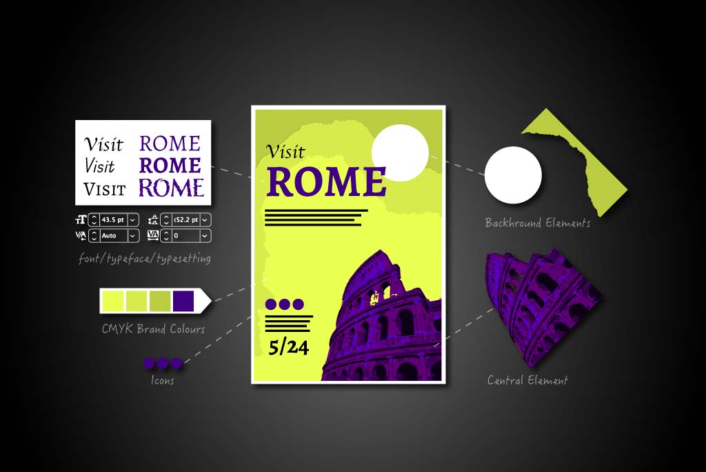
Tips on How To Design a Good Poster
Impactful and relatively inexpensive to produce, the importance of posters in marketing cannot be overstated. Below are some valuable tips on how to design a good poster.
Understand Your Audience
To understand your audience, you must first understand their preferences and motivations. This information will inform and underpin your design methodology moving forward. Knowing what your product or service is and the ethos it communicates will help you target the people who would most likely benefit from it.
Though posters are viewed by large numbers of people at once, each viewing is personal. A poster that seeks to communicate on a personal level with an impactful and relatable message is more likely to succeed than a poster designed for the masses. A net cast too wide catches no fish.
Define Clear Objectives
Simplicity is key to designing a good poster. At its core, the poster is simply a device that delivers information. An arresting image must be there to serve the information, not to upstage it. It is one thing to draw the viewer’s attention, but it is quite another to sear it into the viewer’s memory. The primary goal is the power of the message, the emotional hook that speaks to a common (or specific) need in your target audience. Knowing what that need is provides a firm basis to set and measure your objectives.
Choose the Right Design Elements
Your poster may only have a few moments to capture a bystander’s attention. The perfect balance of layout, colour, imagery and text will make the most impact. A clean, uncluttered layout with a powerful focal image and a minimal amount of information clearly and logically presented gives you the best chance of attracting and sustaining attention.
Select an Eye-Catching Colour Palette
Colour selection is a science in itself. Though loud colours can draw attention easily, they may be completely at odds with your brand’s true character. To engage an audience, you must identify which colours align with your brand’s persona. A portrayal of strength and energy can be captured with a burst of orangey-red, or alternatively, a sense of calm and tranquillity can be achieved with a pastel blue or purple.
Humans respond to colours emotionally, assigning meanings to them unconsciously. Whether these associations are informed by evolutionary traits, personal experiences, cultural influences or a mixture of all three, colours activate very real feelings.
Knowing how to design a good poster means understanding what your target audience wants. This gives you the confidence to select from a more focused palette. When perfectly aligned with your brand’s personality and mission, the colours will make your poster vivid and memorable. Learning the basics of neurodesign can further inform your colour and overall design choices.
Incorporate Engaging Imagery
Above all, posters are a visual medium. Images require very little work on the viewer’s part and are the most immediate gateway to a person’s emotional centre. Faces, in particular, are the most prominent type of image in posters. As children, faces are among the first things we lay our brand-new eyes on. Faces elicit a primal recognition of our shared humanity. The smiling model in the perfume ad or the crying girl in a charity campaign both elicit a level of emotional relatability that other forms of imagery struggle to match.
Like colour, we apply meanings to shapes as well. Abstract designs can suggest things to the unconscious mind in much the same way ink-blot tests do. Knowing the message of your brand and the audience it is most likely to appeal to allows you to play with the preconceptions and associations held by your audience.
But balance is important. Abstract designs can alienate people as they may demand some initial figuring out. This can disengage or even anger a viewer who is not prepared or obliged to make the cognitive effort. Simple, bold and uncluttered imagery is far more likely to engage a viewer and leave a lasting mark.
Choose Fonts Based on Readability and Style
The time a poster has to capture the passersby’s attention is very brief. The text needs to be large enough to draw focus but without disturbing the balance of the overall design. The typeface should never compete with other elements. Rather, it should complement the imagery to produce a visually appealing whole. As a general rule, sans-serif typefaces such as Arial, Verdana and Roboto are reliably effective. They each share boldness and simplicity that makes them very easy to read, even from long distances.
For more lavish products, it is common to use more decorative and cursive fonts, but there is a risk that readability will suffer. If you opt for such fonts, ensure the spacing between letters is widened to improve the legibility of trickier fonts. Observing the type from a distance will help you judge what kind of adjustments should be made.
Colour, again, must align with the brand message and emotional intent of the poster. Font colours should be compatible with the general palette so as to enhance rather than detract from the overall poster design. Pronounced contrast will separate the type from the background, allowing the words to pop and command attention.
Balance Text and Visuals for Optimal Impact
Imagery and typeface must work in concert to achieve a singular goal. Every element, including negative space, helps to create a poster design that is uncluttered and balanced. People have evolved to seek order and comfort. Overly busy designs can be very off-putting or even stressful. Our sense-making minds require balance, familiarity and rational organisation.
Use Consistent Brand Elements
Develop a style guide that lays out the key elements that will recur across other forms of your branding. As a poster represents only part of a branding campaign, it must fit within the broader design concept. Accompanying leaflets, business cards and social media ads should incorporate the same use of logo, colour palette, imagery, typeface and tone of voice to create a cohesive and consistent brand identity.
The style guide should ideally be developed by branding professionals and followed across all company departments and every conceivable touchpoint. Whether in-house or outsourced designers, web designers, social media managers, printers, packagers or PR personnel, all involved parties must work to the style guide to maintain a strong market presence. Keep alterations to a minimum or risk obscuring your brand identity and confusing your audience.
Lastly, messaging must also be consistent so it remains rigidly in line with the personality and values you have carefully built up over time.
Create a Strong Visual Hierarchy
Though all elements are equal, some elements are more equal than others. Hierarchies, or the prioritisation of elements, help guide the viewer’s gaze towards the poster’s primary focus. Because the transference of information and the retention of it is the purpose of the design, the viewer must be able to identify the dominant element (the product info) and then the supporting elements after that. If an image draws the initial attention, then a design element must be present to direct the eye towards the product information in some way. Your design concept will ultimately determine which element commands attention first. Regardless, every design element serves a specific role. They should never fight amongst each other for dominance. Otherwise, the entire message will be smothered by overcrowding.
Utilise White Space Effectively
White space (or negative space) is an element in itself. Compositionally, it allows design elements to breathe, giving emphasis to specific areas of focus. The clear separation of background and foreground elements and a healthy distance between type and imagery allow each part to work in service of the other rather than in competition with it. The type should always be easily readable, and images should have plenty of space to pop and dazzle.
Craft a Persuasive Call to Action
Ultimately, your poster’s goal is to make your audience take action and engage with its proposition directly. Because posters have no clickable element as a web page does, a poster’s call to action (CTA) relies on traditional design to prompt the viewer to act. With the hierarchical structure in mind, the CTA should appear after the introductory information and imagery have been absorbed. The CTA must be clear and distinct enough from the other elements to indicate its interactive quality without interfering with the introductory focus elements. A simple boxed area with “Call in store to find out more” or “Go to our website at…” would be a typical CTA for a poster. Simple, direct language is necessary here.
Review and Test
Proofread the copy several times. As a poster’s primary goal is to transmit information, clarity is key. Simple spelling and grammatical errors will muddy the message or cause the viewer to misread the information. Reading every sentence out loud allows you to hear if the words are projecting the correct meaning. It also helps you to judge its rhythm and length.
Asking someone else unfamiliar with the project to read the information aloud can help you gauge if the information will be clear and understood by the public at large.
Variations of a poster design can be tested on different groups. A/B testing (split testing) allows you to present alternative designs to different groups. You can determine which poster performs better by comparing how receptive each group is to the poster they were presented with. This also helps you identify and adjust “problem” elements picked up by the group participants. Mastering how to design a good poster requires constant augmentation, trial and error, and an awful lot of patience.
Printing and Production Considerations
The design of your poster also depends on its proportions. Larger posters for bus stops are typically 102 cm x 152 cm and can be used for a wide variety of advertising. This poster size also has the benefit of maintaining its clarity from long distances.
For smaller posters that can be displayed in shop windows, an A2 size of 42 cm x 59.4 cm is extremely common. When it comes to scaling the image up or down, be aware that the poster design may not retain its visual impact. Adjustments might have to be made to align with any changes to the width or height. The aim is to preserve the balance of elements as the dimensions change.
With colours, it is important to bear in mind that vibrant colours displayed on computer monitors don’t translate to printed goods. In most cases, the design work will be done on a computer with a monitor display. The vividness of the colours is partly due to the monitors being backlit. This always flatters the colours, making them brighter and crisper. The RGB colour space (projected pixels of red, green and blue) is added to a base-black colour, eventually approaching white.
The CMYK colour space is best suited for printed surfaces. Pigments of cyan, magenta and yellow (CMY) are applied to a base white that approaches black. The black (key) pigment is added to produce shadows and outlines.
Though the CMYK colour space can produce many colours, it cannot recreate the vibrancy of the design displayed on your monitor. To limit colour conversion errors, set your software file to the CMYK colour space before designing and exporting.
The “bleed” refers to the extra design work around the top, bottom and sides. You don’t want to cut into the main body of the design, so the extra bleed ensures the cuts capture the entire design at exactly the right dimension. This prevents the design from running short of the desired size and leaving the white of the paper underneath exposed.
The margin accounts for the space between the outer edge of the design and where the design elements start. This ensures that the composition is balanced and framed in a pleasing manner. Design elements should not begin from the very edges of the poster (unless the design concept requires it).
Don’t be afraid to print as many copies as you need until you get as “true” a print-out as you can. It is best to collaborate with professional printers, as the process can be very trial-and-error and time-consuming.
Conclusion
While the majority of advertising has moved into the online space, traditional methods of printed marketing are far from obsolete. In fact, poster design is experiencing something of a renaissance. With the advent of new design trends and technologies featuring a dizzying array of specialist tools, never has there been a time when posters have looked so dynamic and appealing. Informed by great leaps in online marketing, poster designers have incorporated the techniques of the new to revitalise the old.
How to design a good poster is not an exercise in nostalgia, nor is it an either/or choice between online and real-world advertising. Rather, both forms complement and reinforce each other beautifully. The poster remains an indelible feature of cultural importance, not just as a reflection of passing trends but as an instigator of them. For now — and for the foreseeable future — posters are part of our daily waking lives.
Does your business’s poster campaign need levelling up? Altlier’s skilled team can help you create eye-catching posters that will increase brand recognition and lift your business heads and shoulders above the rest. Check out our services and get in touch!