INPUD
One Voice, One Look
- Content Creation
- Graphic Design
- Branding

INPUD Project Details
Work With UsProject Summary
Client: A peer-based organisation in the field of human rights and harm reduction
Service: Content creation, graphic design and branding
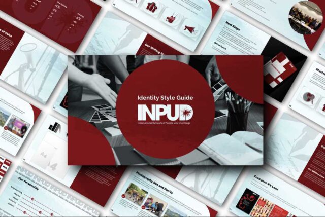
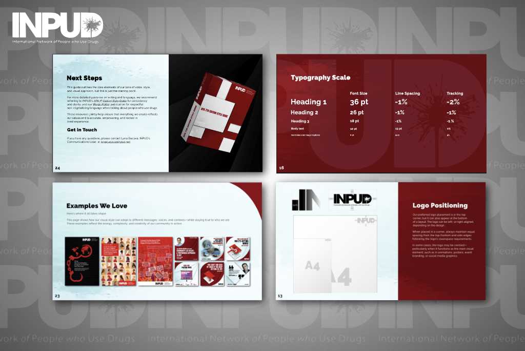
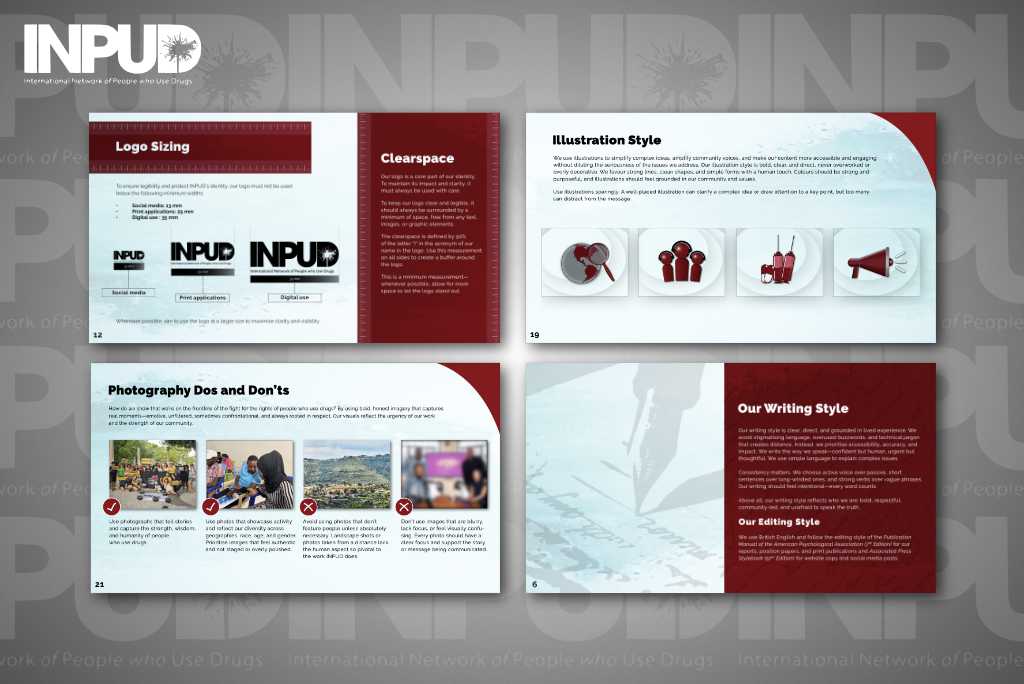
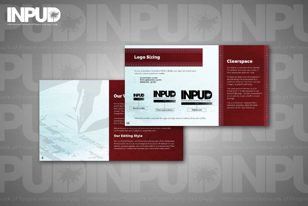
Result: A stylish and captivating identity style guide that demonstrates the practical and precise application of brand assets
Client
The organisation is a global leader in peer-led harm reduction and advocacy for the human rights and health of people who use drugs. Through its achievements in international-level advocacy, INPUD has led the way in combating stigma, driving change and supporting a vast network of parallel advocacy groups at national and regional levels.
The Goal
To reinvigorate and codify the visual representation of INPUD’s brand identity on its website, across its many digital and print publications and its social media channels. INPUD wanted a style guide that clearly set out the rules and recommendations for designers to adhere to when developing project material for the organisation.
The Problem
INPUD’s design philosophy was never formally researched, measured or compiled in a single publication. Design decisions would vary from project to project because no underlying method was set down for designers to follow. Inconsistencies and mismatched styles across INPUD’s public footprint meant their brand identity lacked cohesion and a clear mission statement.
Our Solution
To apply tried and tested design methods and guidelines to INPUD’s web and print publications. Loosely defined rules and signature elements needed to be refined or overhauled entirely to bring order, style and consistency to INPUD’s brand identity.

The Work
First, we focused on INPUD’s personality, its passion for justice and meaningful action. We liked the deep, rich red INPUD had used on its website and the way it contrasted with the surrounding white, so we preserved it and selected a range of complementary colours to bolster its visual appeal.
It was important that any decisions made in terms of the sizing and positioning of elements were rational, attractive and repeatable. We tested many permutations and designed easy-to-follow illustrations and diagrams to describe measurement recommendations and how to action them perfectly each and every time.
Font choices and settings were also rigorously tested to balance beauty with readability. Font pairings were also tested to add variety to exclusive sections or titles and headings.
The layout was generally divided into red and white blocks, a theme carried throughout the style guide. We still wanted each page to have its own personality, but not at the expense of the overall look.

Final Product
A stylish and captivating style guide that demonstrates the practical and precise application of brand assets. These included logo sizing and positioning, typography, colour-pairing, photography dos and don’ts, and much more. It’s clear, informative and a banquet for the eye.
All aspects of the brief were tackled with flair and imagination
I've been very impressed with the level of care and detail that went into the final product. All aspects of the brief were tackled with flair and imagination whilst carefully maintaining overall clarity and practicality. The tip sheets and videos work extremely well as a whole and serve as valuable additions to our online presence.

