EuroNPUD
2024 Annual Report
- Content Writing
- Graphic Design
- Layout
EuroNPUD Project Details
Work With UsProject Summary
Client: EuroNPUD is a peer-led organisation representing people who use drugs within the European Union and the neighbouring countries
Service: Content writing, graphic design and layout
Result: : An extremely stylish and professional annual report
Client
EuroNPUD promotes the health and defends the rights of people who use drugs in the European Union and its neighbouring countries through self-organising, developing technical resources, capacity strengthening, and advocacy.
Through a combination of coordinated country campaigns, thematic development projects and leadership development activities, EuroNPUD strives to fight stigma and influence policy on both a national and regional scale.
The Goal
To produce a 20-page overview of EuroNPUD’s activities over the course of the previous year. The report needed to demonstrate the positive developments and achievements their advocacy garnered, as well as give an inviting and attractive insight into the working practices of all the peers involved.
The Problem
Recent funding cuts across the HIV sector had put EuroNPUD under tremendous strain. With dwindling resources, they still needed to produce an annual report of sufficient quality to attract funders and policymakers.
Our Solution
To create a report that oozes professionalism and authority. We felt that donors and government bodies would be receptive to EuroNPUD if they were positioned in a more elevated manner. Perception management was key to our strategy. We felt the more professional and stylish the report was, the more this would reflect well on EuroNPUD, attracting more financial support for their work in the future.
The Work
For the bulk of the written content, emphasis was placed on the merits of EuroNPUD’s campaign work and the observable benefits experienced by the community. We also ensured the copy connected these benefits to a wider, socio-political discourse, alerting funders and policymakers to the real social benefits of EuroNPUD’s brand of activism.
Each campaign goal was laid out, followed by a detailed description of the peer-led activities that fulfilled the campaign objective. As evidenced by photographs and quotes from peers themselves, we produced copy that built a real sense of group participation and achievement.
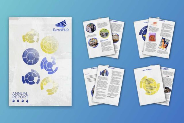
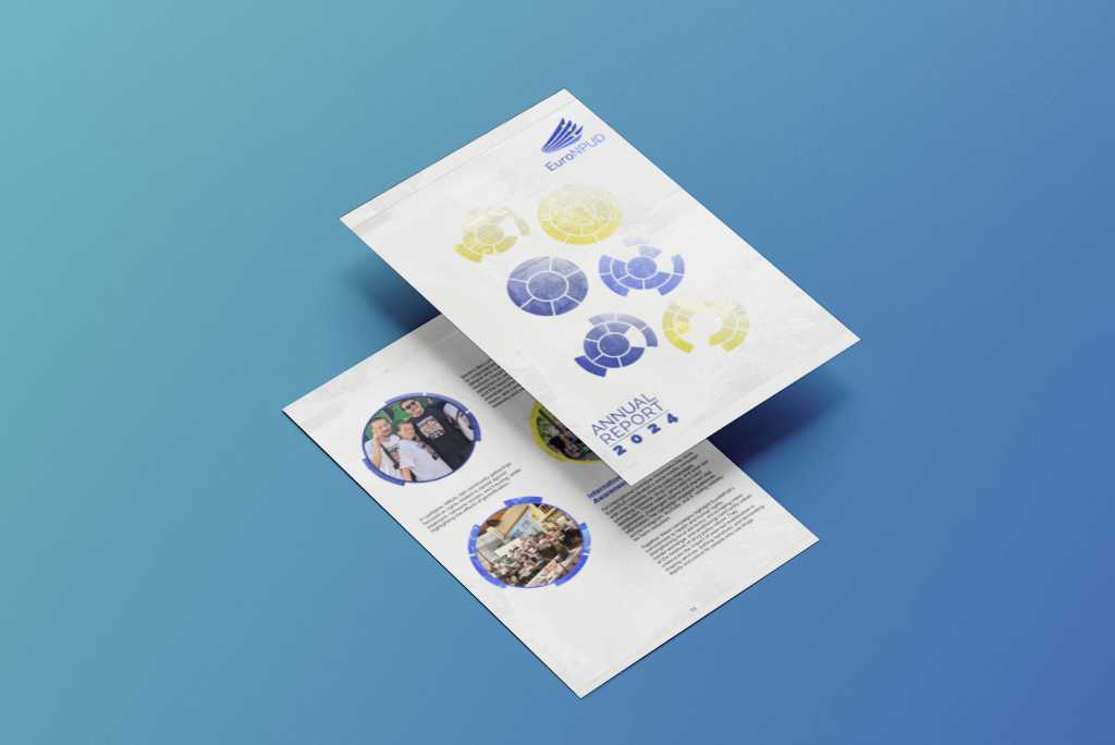
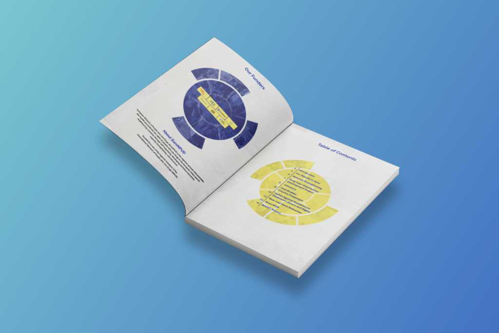
Design-wise, we moved away from the garish and cartoony styles we’d encountered researching the sector, choosing a cleaner and more restrained approach. Circle patterns were used as a repeating motif to imply unity and togetherness.
Pastel colours (sampled from EuroNPUD’s logo) were used to produce a subtle, unintrusive tone, blended with a textured overlay to give every page a sense of depth and character.
Photos were placed in circular frames to tie in with the theme of unity established by the cover design.
Final Product
An extremely stylish and professional annual report, a cut above typical publications found in the NGO sector. The client was very happy with how fresh and approachable the final product looked and gave particular praise to how well the written material conveyed the nature, spirit and urgency of EuroNPUD’s brand of advocacy.
All aspects of the brief were tackled with flair and imagination
I've been very impressed with the level of care and detail that went into the final product. All aspects of the brief were tackled with flair and imagination whilst carefully maintaining overall clarity and practicality. The tip sheets and videos work extremely well as a whole and serve as valuable additions to our online presence.

Judy Chang
CEO, INPUD